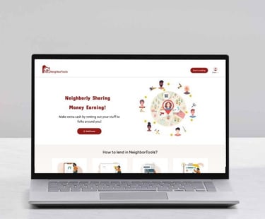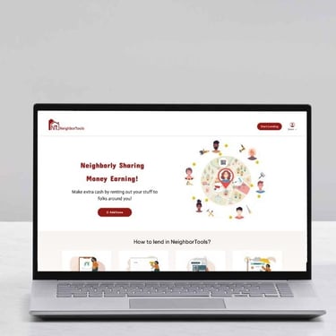
NEIGHBORTOOLS
A secure, user-friendly platform that connects tool owners with renters.
BORROWING CASE STUDY
NeighborTools connects tool owners with renters in a safe, secure peer-to-peer sharing platform. Owners make money from unused tools, while renters save by avoiding purchases and supporting local communities.
In a team of three for 3 month we worked to design a website to facilitate the process of lending and borrowing tools among people.
MY ROLE
KEY CONTRIBUTIONS
TOOLS
TEAM
DURATION
UX Designer
3 UX Designers
3 Months - Part-time
Figma, Photoshop
Canva, Google Forms
User Research
Wireframing
Prototyping
Interaction Design
Usability Testing
PROJECT OVERVIEW
LET'S TAKE A LOOK AT THE FINAL DESIGN BEFORE WE MOVE FORWARD

THE SOLUTION
In the video below, I demonstrate the flow for searching and borrowing a tool on the NeighborTools website.
PROBLEM STATEMENT
People struggled to find affordable tools for occasional use, and the lack of storage space made owning these tools even more impractical. Renting from traditional stores was too expensive, and borrowing from friends or family was not always an option, leading to frustration and inefficiency.
OUR SOLUTION
We developed a user-friendly website that connects neighbors for seamless tool sharing. Our platform ensures transparent pricing, easy booking, and reliable tool condition descriptions, eliminating the hassle of traditional rental stores. Users can conveniently browse nearby tools, check availability in real-time, and enjoy the affordability and accessibility of shared resources within their community.
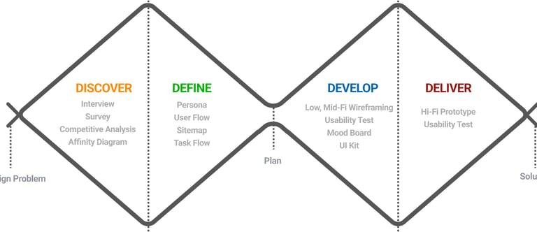
For this project we used the User-Centered Design to ensure always keeping our users at the heart of every design decision. The process includes analyzing the problem and users, defining the features and product flows, designing screens using wire-framing and evaluating the app with real user testing. This is done in a cyclical way in order to constantly iterate and improve on the product.
USER-CENTERED DESIGN PROCESS
DISCOVER
In the beginning of our journey we decided to educate ourselves to better understand who we are designing for and how users are currently rent/lend their tools, so we conducted an initial interview with 8 individuals. To find the interviewees we posted in our neighborhood Facebook group. We aimed to identify their pain points and crucial factors involved in these processes by inquiring about their past experiences and preferred locations for borrowing tools.
Six out of eight interviewees expressed concerns about Potential Damage to borrowed tools and the Risk Of Fraudulent Activity.
Voices of the interviewees








It’s not easy for me to rent electrical tools from people because of potential loss or damage.
The tool I want to rent should be clean and function properly.
I look to rent near my neighborhood. I don't like to drive far to rent a tool.
I would definitely check the price of rental tool and compare it with purchasing the tool.
NOW LET'S UNCOVER THE JOURNEY TO THE FINAL DESIGN
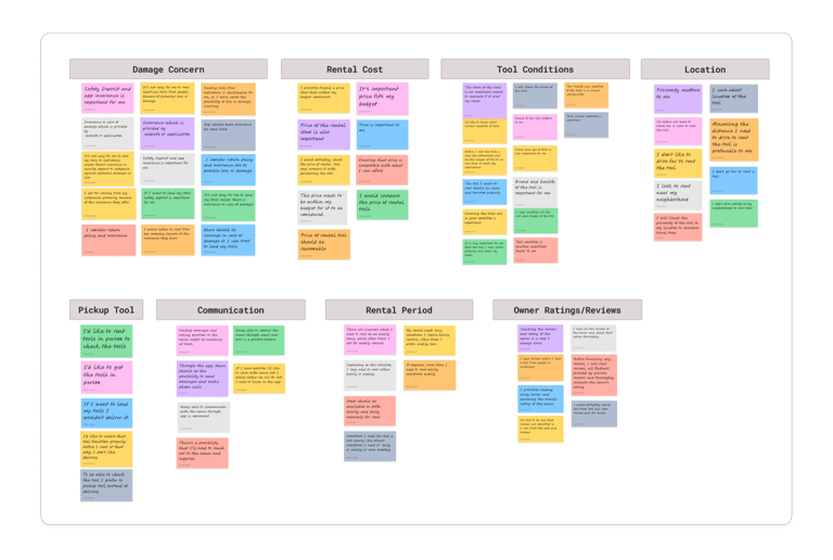

Here's what we found is essential for our users:
Concern regarding tools Damage.
Knowing about condition or health of tools.
Finding tools close to their location.
Finding tools that fits their budget.
To sort out the info, we used AFFINITY MAPPING, grouping user thoughts into clear trends.
We looked at Facebook Marketplace, as a good customer to customer app and Airbnb, as a successful app for sharing personal properties, and eight other similar websites. By studying them, we learned valuable lessons to implement the user experience of our product. We used them to inspire to build our information architecture and user flow.
CHECKING OUT WHAT THE COMPETITION IS UP TO TO SEE WHERE WE CAN SHINE?
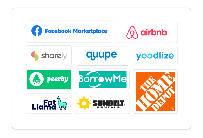
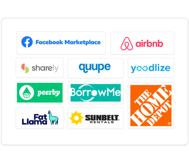
Here's what we found:
We discovered that we should highlight great features that Neighbortools has like search by distance, price suggestions in listing tool, and confirming tools before deducting money; Since most of our competitors don't offer these.
Also we inspired how to present these feature and have a seamless and smooth borrowing journey.
GAINING DEEPER INSIGHT INTO USER NEEDS TROUGH A SURVEY
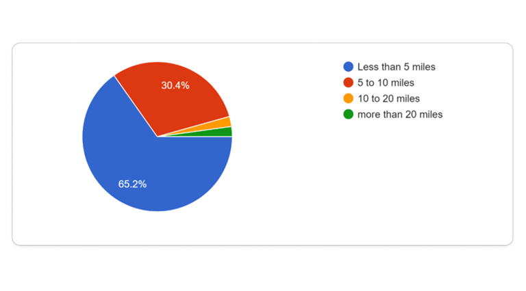
As part of our research and In order to connect with more people and understand more about the user's pain points, needs and what influence them to trust an app and borrow their tools we decided to design a survey. We received a total of 46 responses.
76% of participants consider distance in borrowing a tool and 65% of them preferred less than 5 miles traveling distance.
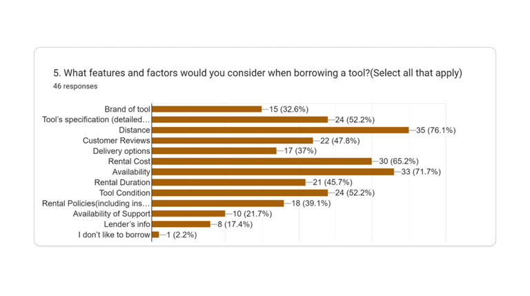
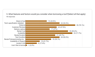
The most important factors in selecting a tool to borrow:
Distance (75.5%)
Availability (71.5%)
Rental cost (65.6%)
Tool condition (59.1%)
Tool's specification (52.9%)
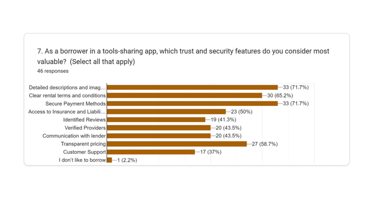
Important trust and security features for borrowing tools:
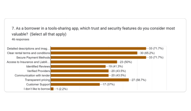
Clear and updated images & description (72%)
Secure payment (72%)
Clear rental terms & conditions (65%)
Transparent pricing (59%)
Insurance & liability coverage (50%)
Based on our research, we should focus on the items below and it became clear that presenting business features effectively and flawlessly is a top priority as users were concerned about it.
TOP TAKEAWAY OF RESEARCH
Users prefer to rent the tools near by.
Users are concerned about the current condition of tools.
Transparent pricing and convenient payment are essential.
Seeing tool availability in real-time is crucial for users.
Users have concern regarding potential damage or loss.
01
02
03
04
05
DEFINE
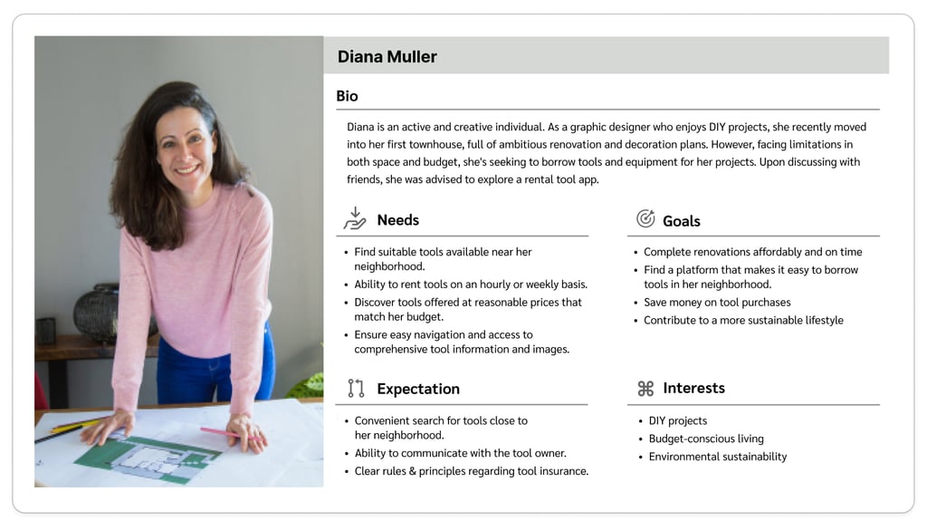
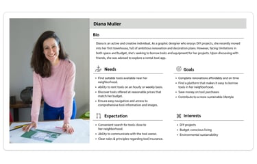
After conducting interviews, we identified a USER PERSONA and brought it to life with visual, to ensure always kept in mind who we were designing for and could easily see what features were needed to make this product useful for our target audience.
WHO WE ARE DESIGNING FOR?
HOW USERS NAVIGATE OUR SITE?
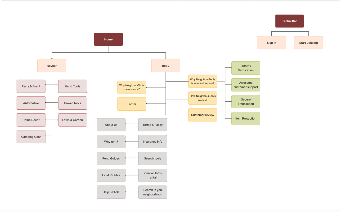
By DOING CARD SORTING, we learned how to organize different sections of our web site and we made first version of our site map. However through out the design process, user testing and the competitive analysis, the FINAL VERSION OF SITE MAP was build.
MAPPING OUT THE USER JOURNEY TO MAKE NAVIGATION INTUITIVE AND FRIENDLY
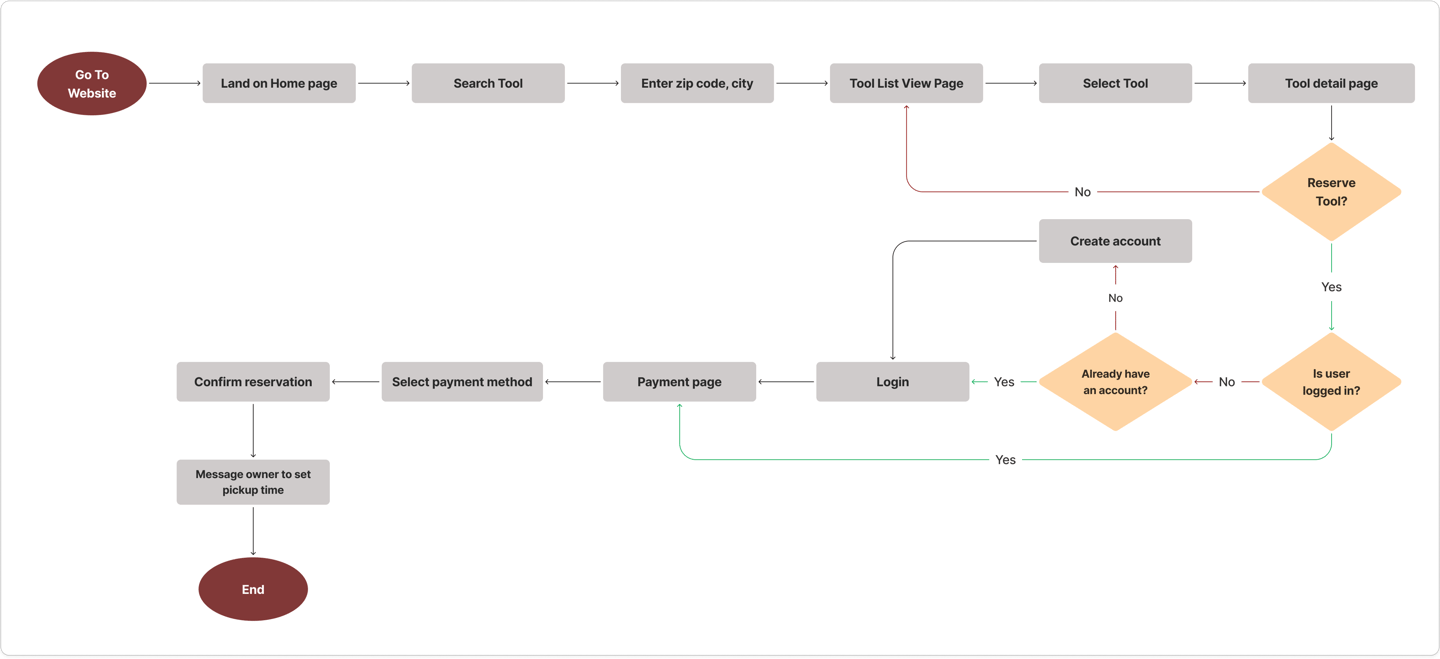
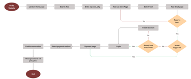
With the user stories and features requirements from the project brief in mind, we developed a user flow diagram to ideate and visualize what screens and interactions users would go through whilst using the website.
DEVELOP
DESIGN CHALLENGES AND POTENTIAL SOLUTIONS
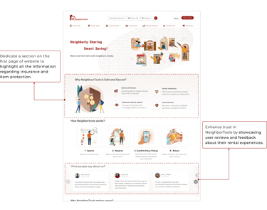
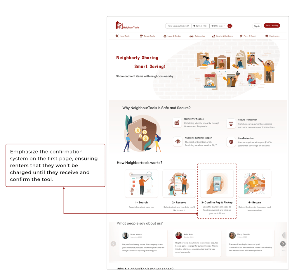
After diving deep into all our research data and understanding users' needs and problems, we endeavored to figure out how we could respond to their concerns and address them by incorporating a solution into our design. Here are the possible solutions we came up with:
Challenge #1:
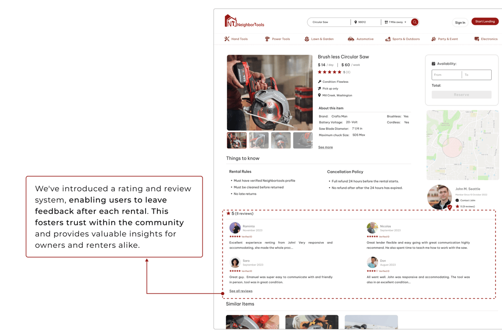
Uncertainty regarding Insurance and tool protection against potential damage or loss for both owner and lender.
Challenge #2:
Concerns regarding both the condition or health of the tool (specially power tools) and whether it matches the pictures provided.
Challenge #3:
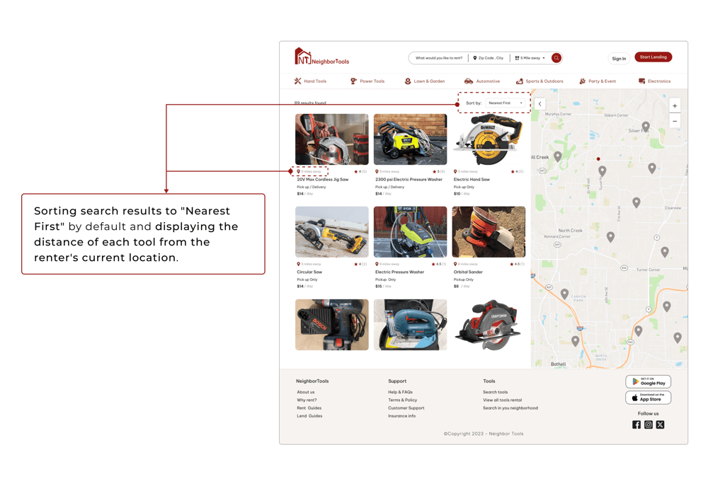
Proximity is an important factor for renters. Most of the users don’t like to travel far when renting a tool.
Solutions #2
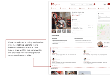
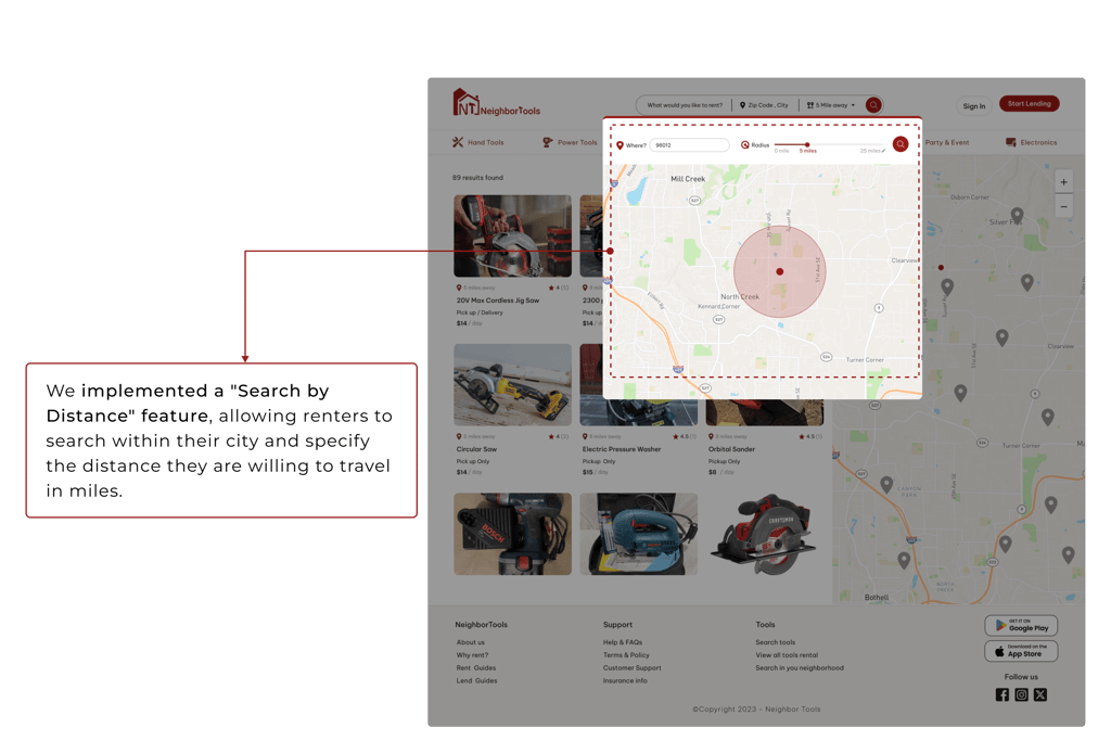
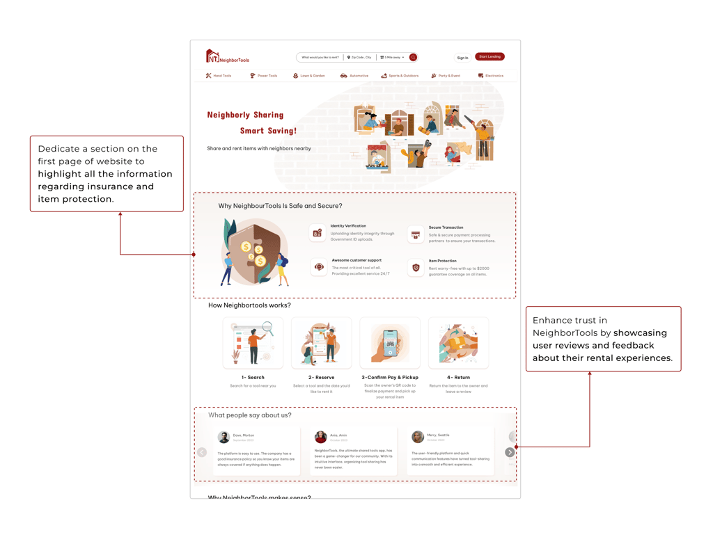
Solutions #2
Solutions #1
Solutions #1
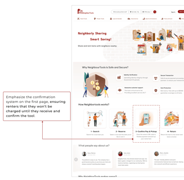
*** To better understand the solutions, I am presenting them in high-fidelity designs.
Solutions #1
Solutions #2
TEAM CREATIVITY: UNLEASHING THE POTENTIAL OF TEAMWORK IN DESIGN
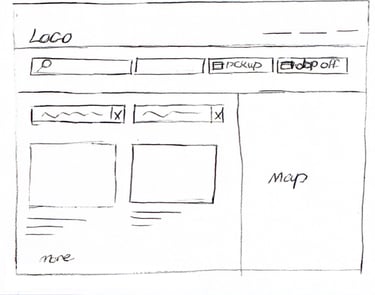
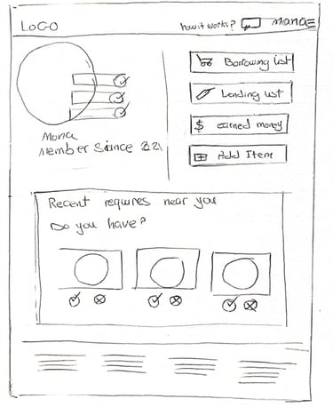
We brainstormed and sketched various design ideas for the website, taking into consideration the needs and pain points of our user persona. We prioritized essential features, such as home page navigation, searching tools and creating a search result and tool's description pages. Through collaboration, we converged on a design that pulled elements from all the sketches. We then moved to the wireframing stage of the low-fidelity design.
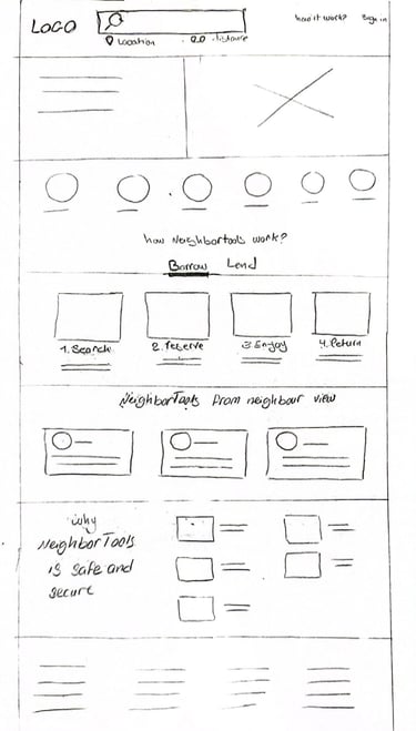
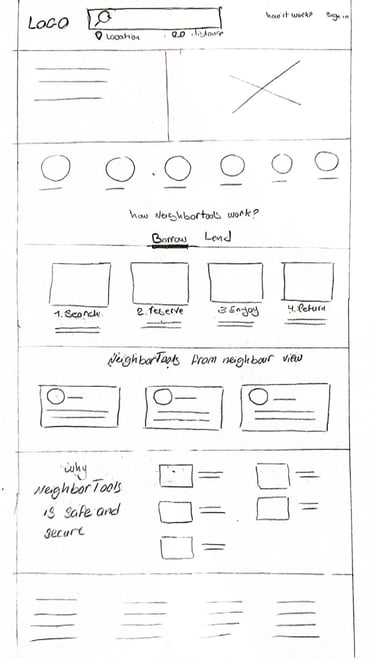
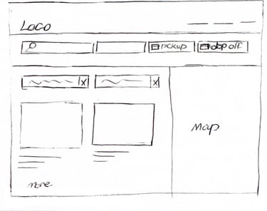
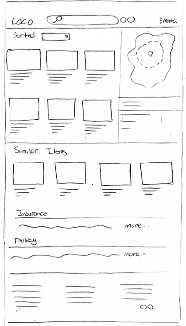
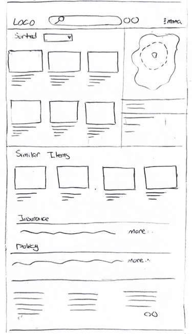
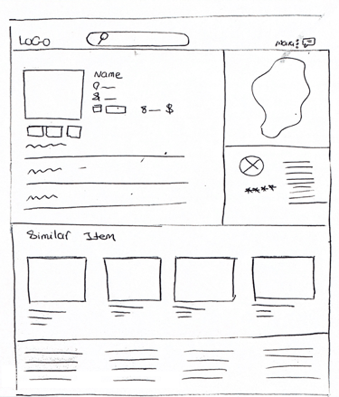
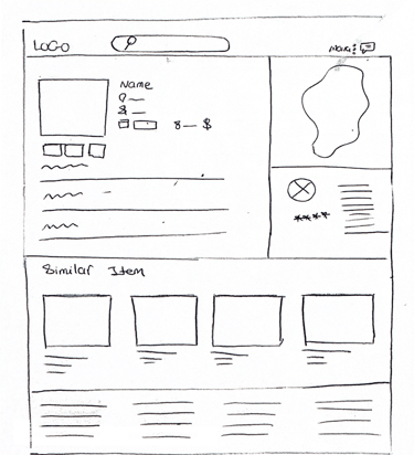
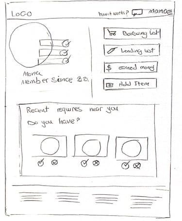
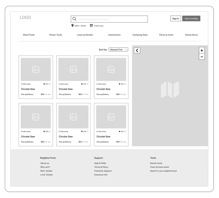
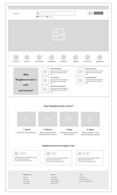
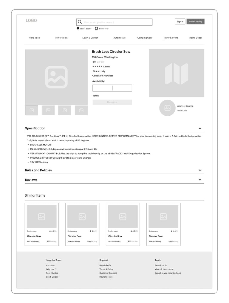
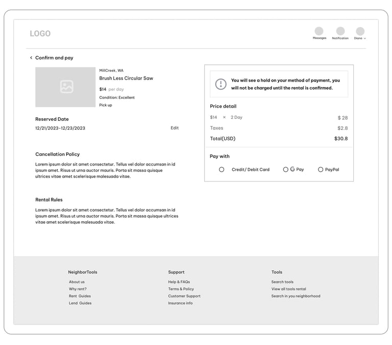
We created Mid-fidelity wireframes on Figma to map out page layouts design vision. The wireframes went through a couple of rounds of iteration before the final content was developed.
"Home Page"
"Search Result Page"
"Item Detail Page"

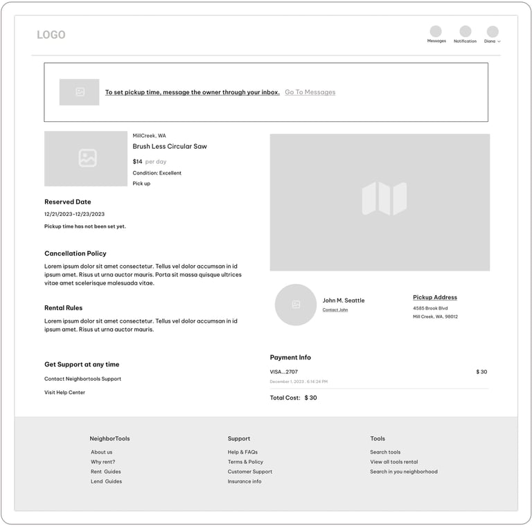
"Payment Page"
"Reservation-Confirmation Page"
ITERATIVE DESIGN PROCESS: USABILITY TESTING (ROUND 1)
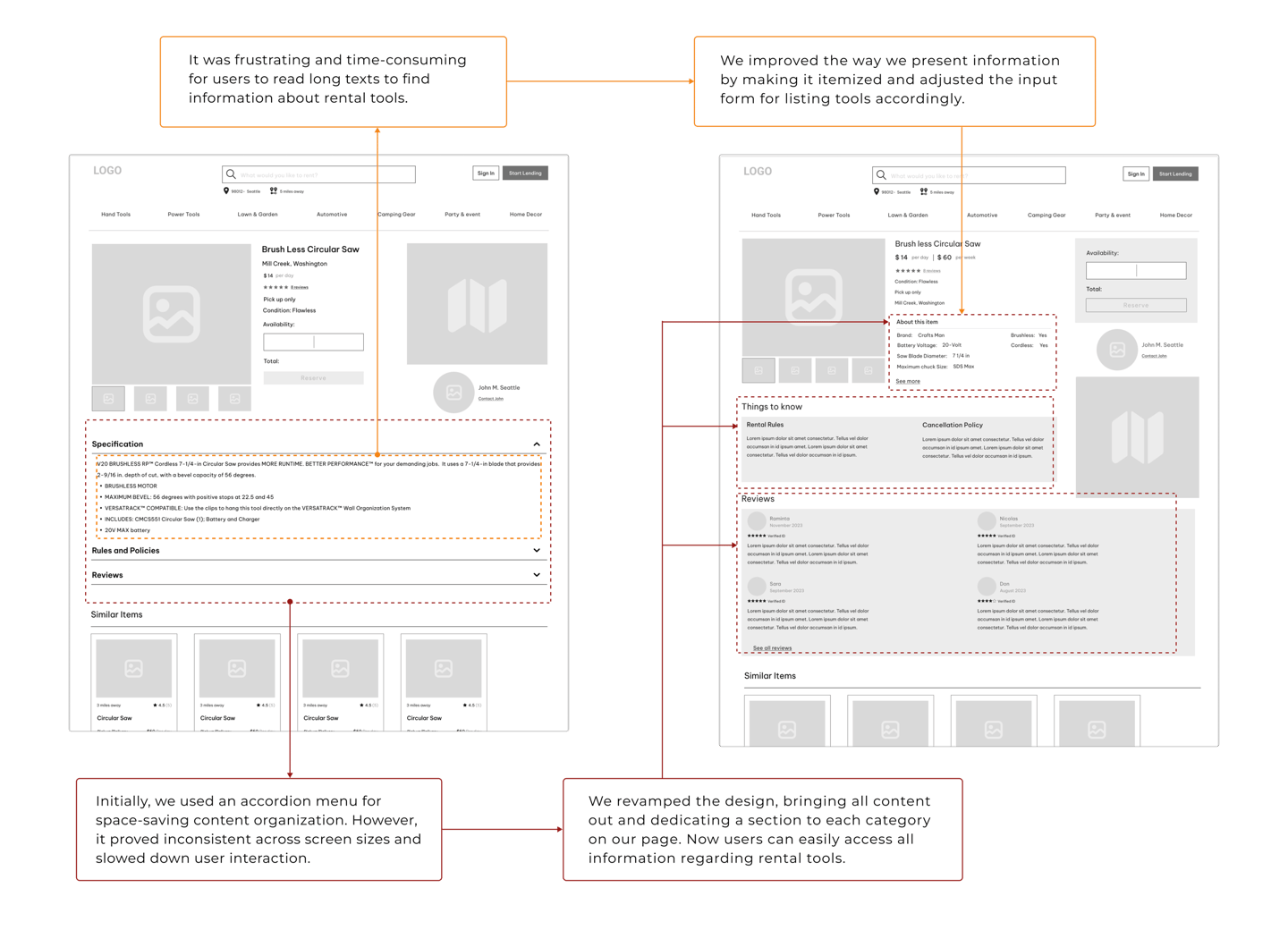
We iteratively created and tested wireframes and interactive prototypes to refine our design. By conducting multiple rounds of user testing, we ensured that our final product met the needs of our user persona.
Here is the iterative design process for 'Tool's Description' page.
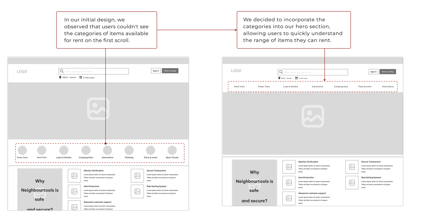
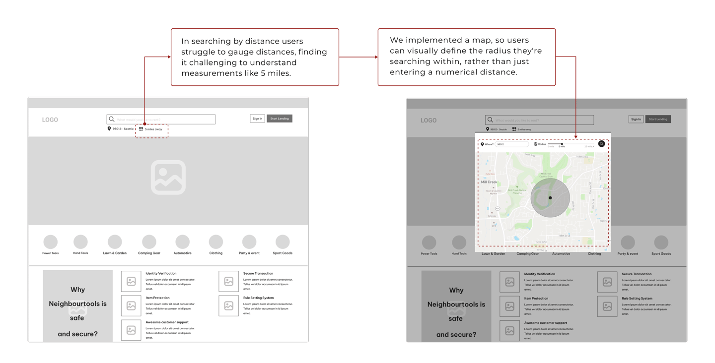
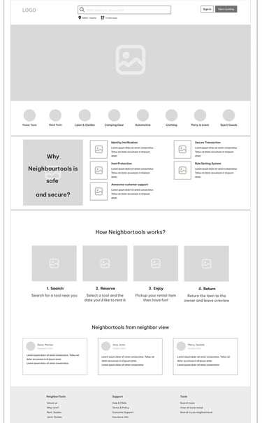
Here is the iterative design process for 'Home Page'.
Before Usability Testing
After Usability Testing
Before Usability Testing
After Usability Testing
DELIVER
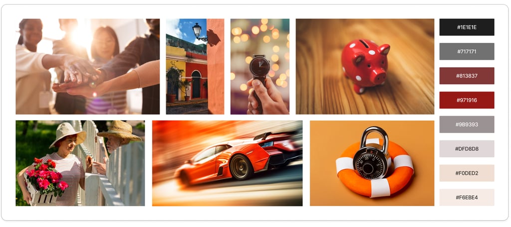
DESIGN INSPIRATION: MOOD BOARD
In order to define the visual direction for NeighborTools, we revisited the persona and reminded ourselves what we wanted our users to feel and think whilst using the website. We wanted to foster trust, establish a friendly, community-focused environment, and convey the message that borrowing tools should be fast, affordable and hassle-free.

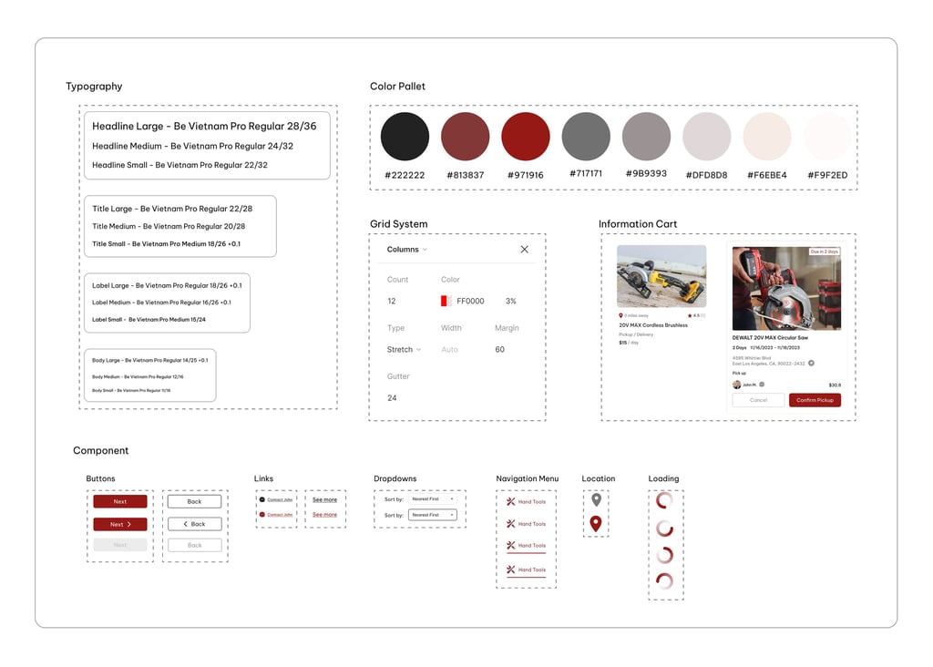
CREATING CONSISTENCY: A VISUAL STYLE GUIDE FOR THE PRODUT
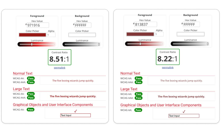
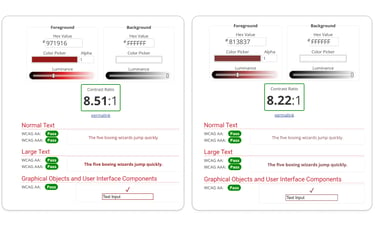
The contrast between the foreground and background colors of the primary and secondary buttons was tested on color blindness websites to ensure acceptability.
ENSURING COLOR ACCESSIBILITY FOR ALL USERS
A visual style guide was created to ensure complete consistency across the product. This guide ensures that typography, color, and UI elements are correctly used by other designers, whether they are recreating or building upon the app.
ITERATIVE DESIGN PROCESS: USABILITY TESTING (ROUND 2)
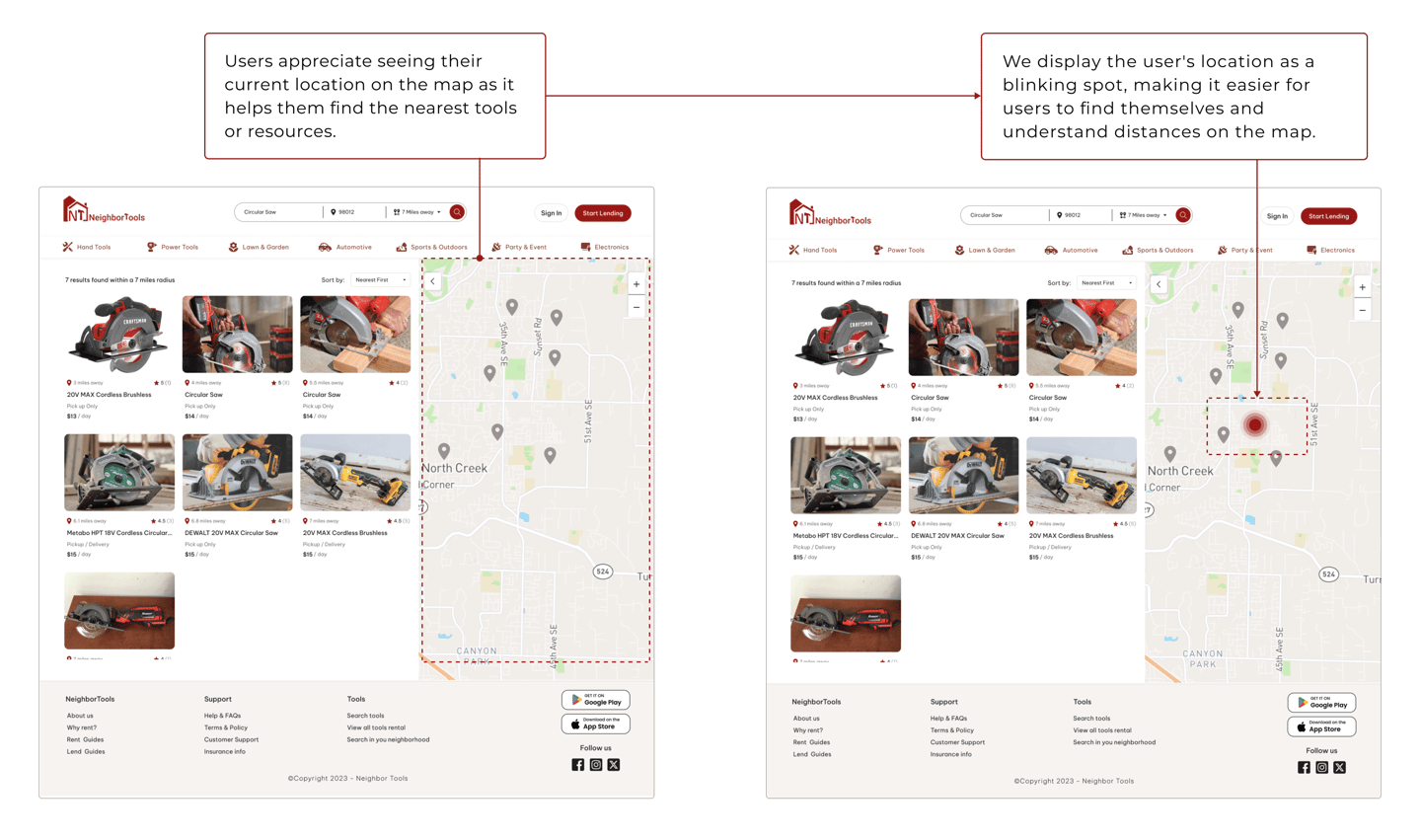
Search Result page
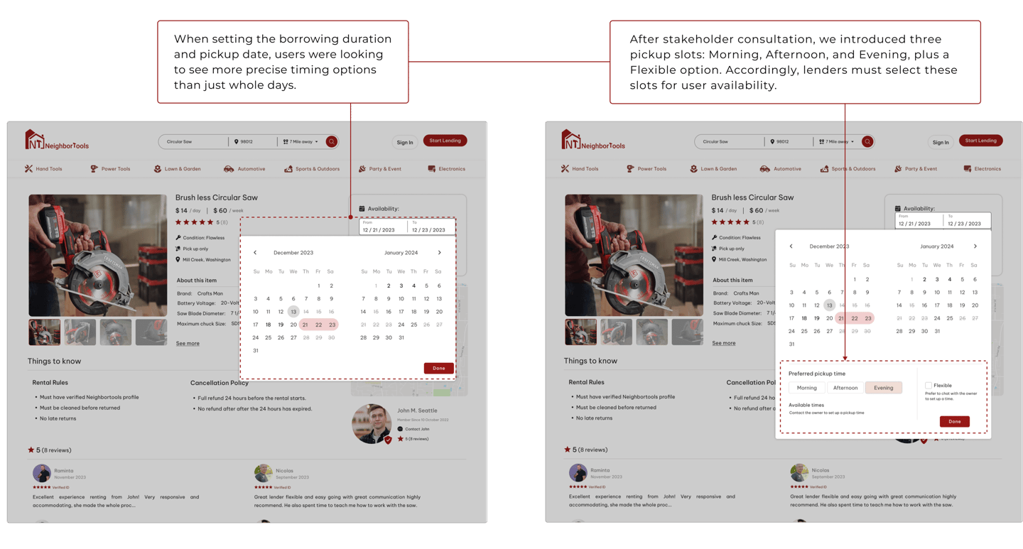
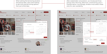
Tool's Information page
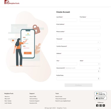
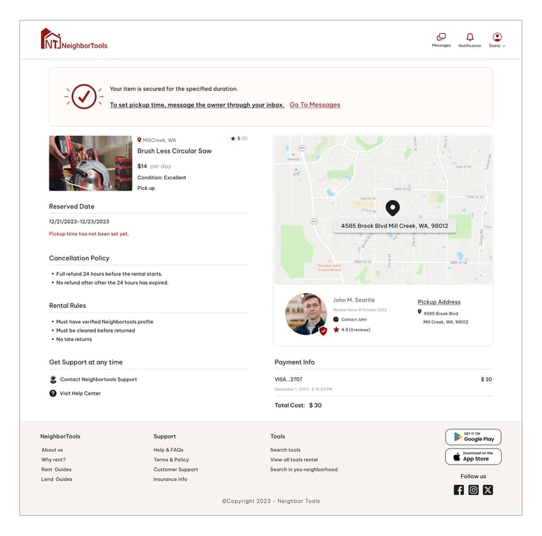
DELIVERED DESIGN PAGES
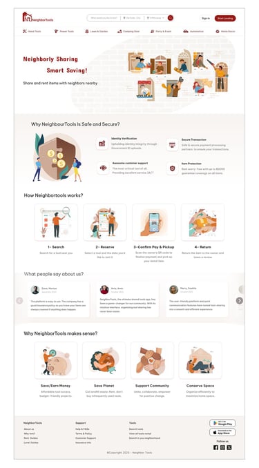
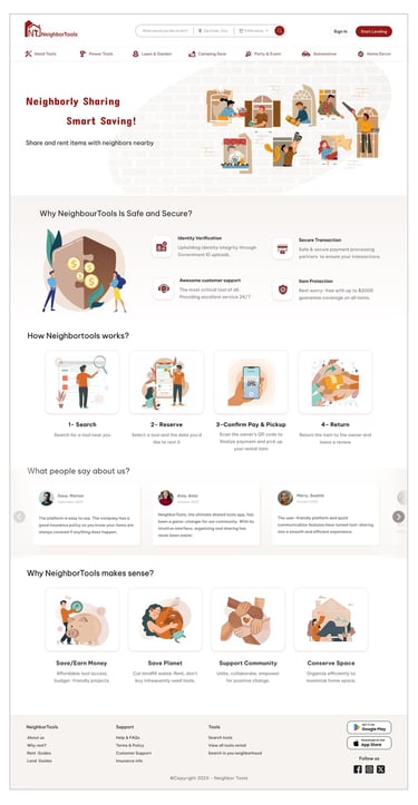
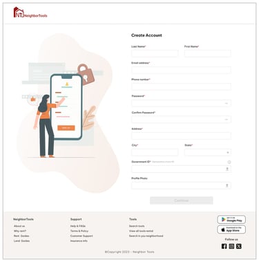
"Create Account"
"Home Page"
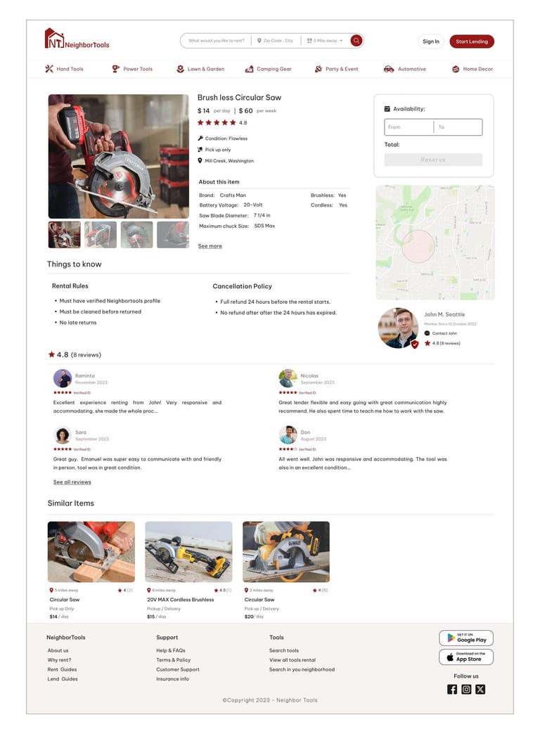
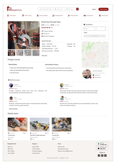
"Reservation Confirmation"
"Tool Information"
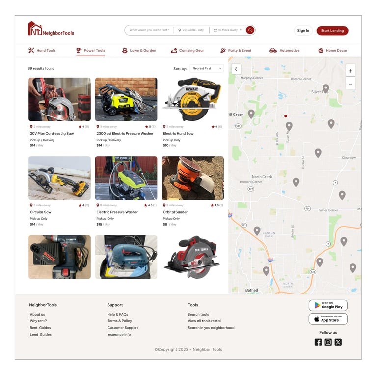
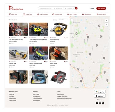
"Search Result"
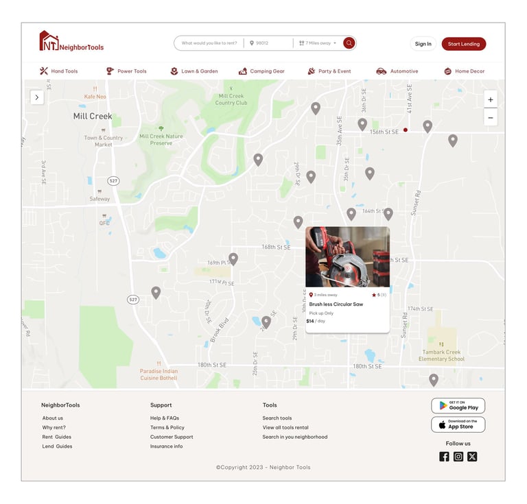
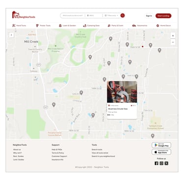

"Search Result on Map"
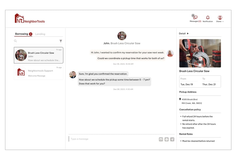
"Inbox"
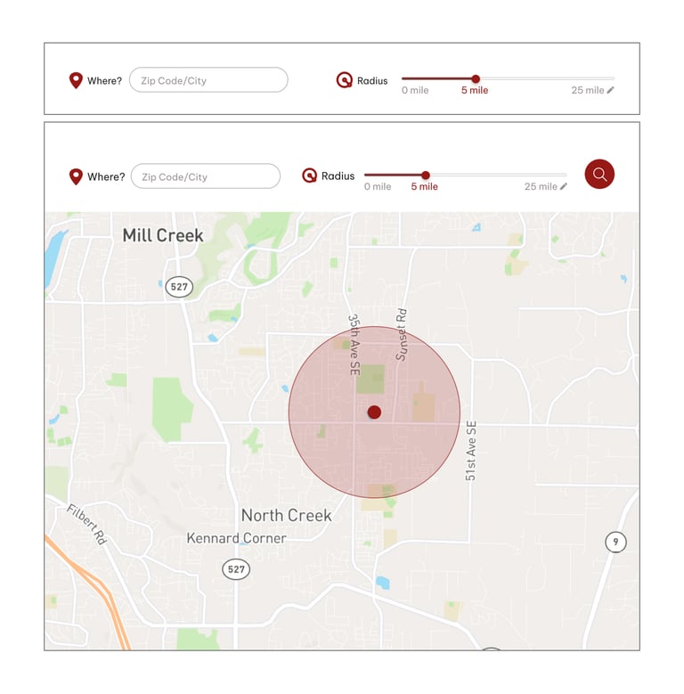
"Search Criteria"


Here is the last prototype, displaying what we've achieved through our design process.
FINAL PROTOTYPE
Reflecting on this project, it was a great learning opportunity for me as a UX designer. Working with a stakeholder and a team of designers taught me the importance of collaboration, communication, and flexibility. I learned to approach design decisions with a balance of user feedback and business goals, and to iterate designs based on ongoing feedback. Moving forward, I will continue to build on these skills and apply them to future projects.
If we were to continue working on this project, our next step would be finalizing the mobile version of the platform. This involves designing and testing responsive versions of the website to ensure it looks and functions well on smaller screens.
Additionally, we would evaluate the current design through more user experience testing and consider solutions for when tools become outdated or less utilized over time.
THIS JOURNEY TOUGHT ME ...
NEXT STEP
See more of my work:
UX|UI Designer
UX|UI Designer
